02 Mar How To Increase Subscriber Pop-up Ratios
We’re always looking to improve a subscriber opt-in ratios aren’t we? I know I am, I’m sure you’re like more subscribers per X-visitors to your website as well. Subscribers are the life-blood of our business. Recently while I was looking for some hard data on ‘how to increase subscribers’ I came across this interesting case study from the guys at “ConversionVoodoo.com”; this article is reprinted with permission.
Enjoy!
If you’re like the other gazillion websites trying to get people to sign up for an email newsletter, then you probably have an opt-in popup form. You know, it’s that annoying lay-over popup box that asks new visitors to opt-in with their name and emails.
Wouldn’t it be nice if there were landing page optimization best practices for designing these? Then your opt-in popups could grab many more subscribers right out of the gate. At the very least, it would be good to know which elements are worth focusing on in testing.
Since we thought it would help a LOT of people to get some straight answers on popup opt-in forms, we got Jeremy “Shoemoney” Schoemaker on the phone (Conversion Voodoo is very lucky to work with the best of the best in online marketing). We had an idea for him:
“Whaddya think about us running some tests on the opt-in popup for your newsletter?” Jeremy’s reply was about as easy as they come, “Have at it!” So we did.
Not only that, but Jeremy requested that we post the results for his audience. All we could say was “absolutely!” We rarely get to publish results because 99% of our clients want to remain anonymous — so this was sweet!
Our goal was to test the “default” settings on the popup to see if there were the better ways to convert visitors into subscribers. We hoped to find some best practices to share with you for your website that may not have a horde of visitors every month like the Shoemoney blog. Although we counted more than 30 different elements in opt-in popups, we whittled that number down to the most relevant (i.e. the ones you should care about), which you’ll see in the tests below.
Frankly, even we were surprised by some of the test results. Wait till you see how your opt-in popup form should be designed to get the most conversions — and you better believe these aren’t the default settings on many of the off-the-shelf packages out there. Good luck and happy testing!
Headline:
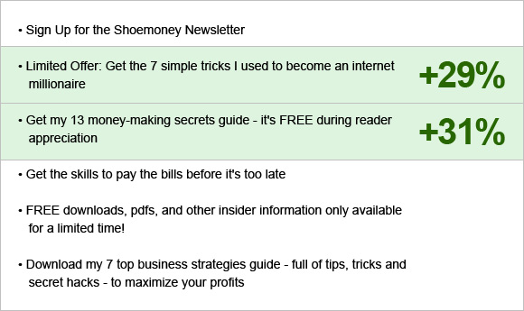
If you’ve been keeping up with our landing page tear-down inspiration posts you know that one of the first things we test is the headline copy. For ShoeMoney’s popup we tested 6 varying headlines and found that there were two clear winners over the baseline.
Hover over the image below to see our changes and findings:
The two headline winners both say exactly what the user is going to “get” when he/she signs up. These headlines also cater to the user’s want to make money online. You’l also notice they use specificity: “7 simple tricks”, and also urgency: “Limited offer”. Find a way to entice your website visitors with something of value worthy of their time.
Inline Field Labels:
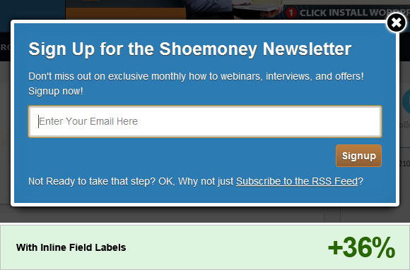
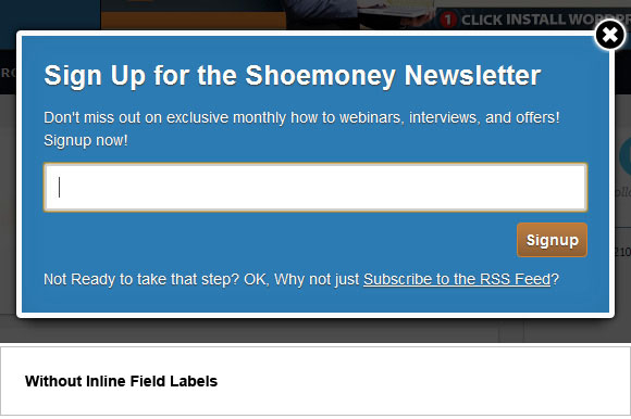
A problem that we found with ShoeMoney’s newsletter popup was that once the user clicked into the field to type their email address, the field label disappeared! Simply by dimming the label within the field we were able to get a good sized bump in conversions. Take a look at your own forms and make sure that the labels are always visible.
Hover over the image below to see our changes and findings:
Bottom Copy:
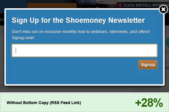
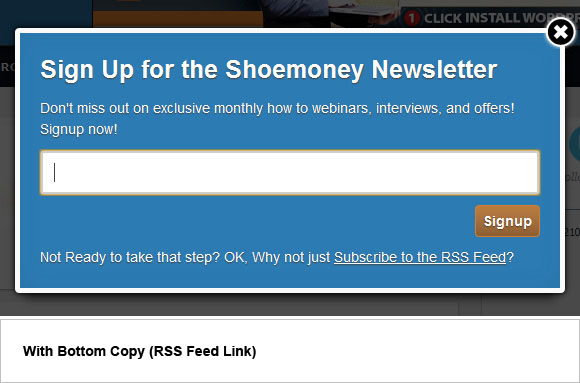
This was another simple test. We compared the baseline bottom copy, which asked users to follow the RSS feed, to having no bottom copy at all. We believed that all friction that can keep a user from the targeted action should be removed. Guess what? It worked… big time.
As a note: we decided to leave the bottom copy visible for the final popup. Though if you want to remove something similar from your own site, we whole-heartily recommend it! And don’t be afraid of losing RSS feed subscribers because once you have then on your email list and are building a solid relationship with your users, you can always ask them to join your feed later!
Hover over the image below to see our changes and findings:
Auto-Center:
While running tests we realized that the newsletter popup on ShoeMoney’s site was in a fixed position. If the user scrolled down the page, the popup stayed at the top and was no longer visible to the user. We tested this baseline against a popup that scrolled the page with the user.
Interestingly enough, the popup that stayed at the top of the page was the winner! We believe this is due to the user still be able to see, but not reach, content behind the dimmed background of the page caused by the newsletter popup. If the user sees something they want to reach, they would be more inclined to enter their information into the popup and opt in.
As a note: on another client’s newsletter popup there was an adverse affect, so this is something you’d want to test on your own site.
Close Button:
When doing market research we find interesting items that competitors to our clients are using on their own site and we tend to test them into our own tests to see how well they do.
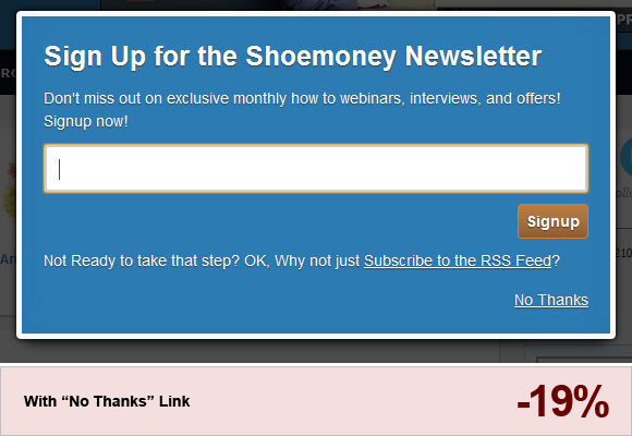
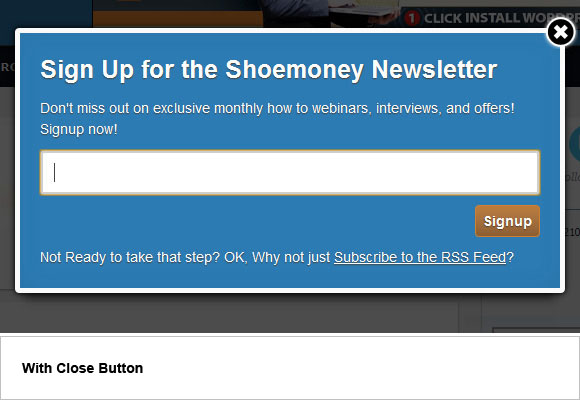
One particular item was the close button on the popup. ShoeMoney’s baseline popup had an “X” button at the top right corner which we tested against a “no thanks” link below the signup button at the bottom of the popup.
Turns out that ShoeMoney had it right from the beginning! The “X” button was a clear winner over the “no thanks” link.
Hover over the image below to see our changes and findings:
Clicking Dimmed Area (outside):
A notable problem we found with the baseline ShoeMoney popup was that if a user clicked on the dimmer area (outside the popup) then the popup would be closed! By tweaking the code so that the popup stayed even when clicked outside we were able to increase opt-ins by 19%.
Re-Popup if Ignored:
The final, and most code-intensive, test we performed was that if the popup was ignored by a user and that same user came to the ShoeMoney page again at a later time, the popup would reappear until the close button was clicked. The baseline has the popup disappear forever if ignored.
Even with this seemingly simple change, we increased opt-ins by a whopping 31%!
Conclusion
Never stop testing! When we went through this newsletter popup we had the intentions of testing every little detail that most people wouldn’t think would matter. Things such as different close buttons or fixed vs. scroll popups. As you have seen some of the smallest changes will lead to big conversion increases.
We hope this post has inspired all of you to jump onto your own websites right now and start making a list of items to test because there are big gains to be had, we guarantee it!
Note: All tests had confidence level of at least 95%, (so these are highly relevant data points) and well over 500,000 unique visitors during testing period (Shoemoney is a pretty big blog). Remember, always test new ideas into your site as your mileage my vary. You also should take into consideration if you should even use a popup form. We don’t advocate using popups, but we also understand how critical they can be to some sites to gain a lasting connection to visitors. You get to decide… Viva America!(Visited 5,109 times, 224 visits today)

